0:45:08
Greening Digital - how to set up your django app with green coding metrics
Published July 11, 2024
This video features Chris Adams at DjangoCon Europe 2019 in Copenhagen, Denmark.
https://2019.djangocon.eu/talks/jupyter-django-and-altair-quick-and-dirty-business/
By Chris Adams: https://2019.djangocon.eu/talks/jupyter-django-and-altair-quick-and-dirty-business/
Jupyter notebooks let developers combine executable code, output, prose, and interactive visualisations in a shareable, reproducible browser-based document. Chris Adams explains how Jupyter’s separate notebook, kernel, and browser architecture supports Python and other languages, and how notebooks are used for analysis, data journalism, operations, and large-scale automation. He introduces visualisation principles from Tamara Munzner’s work—matching data types and attributes to marks and visual encoding channels—and shows how Vega-Lite and Altair provide a principled, Python-friendly way to build charts. Finally, he demonstrates a Django integration that queries application data, returns chart specifications as JSON, and renders them in the browser, using Project Drawdown data to show how visualisation can reveal relationships and high-impact interventions that a raw CSV would obscure.
Summarised automatically from the transcript.
Automatically transcribed, so expect mistakes in names and technical terms.
Speaker 1: Is this working? Yes. Okay. Hello everyone. My name is Chris Adams. Thank you very much for giving me your attention for the next uh 25 minutes. Um if you've ever been to DjangoCon before, you may remember me from uh DjangoCon Europe in Florence in 2017 when I spoke about Django and climate change. And if this interests you, I'm running a workshop tomorrow to apply the ideas in that talk to your own project called Green Your Django Project. If you've heard the name Chris Adams before in the Django world, uh There is a I I this this happened last night. Oh you're Chris Adams. I use all your stuff. Um sadly that was that guy, not this guy, right? I am the less famous, uh less well-known instance of Chris Adams in the Django community and I now believe I am doomed to live in this man's shadow.
Speaker 1: One day we might meet and I suspect if we touch, we'll end up annihilating each other in some kind of weird antimatter explosion. But I digress. Today I'm here to talk to you about Jupiter, Outer Django. And uh I think I'm talking to you because there are three interesting projects. And uh for the next 25 minutes or so, I'm gonna split this talk into three main parts where I'll talk to you about notebooks, share some useful theory about visualization, and then show you how to apply this in a Django project. So are you sitting comfortably? Yeah, then I'll begin. Okay, so let's talk about notebooks first. First of all though, I feel compelled to congratulate you all on your life choices. on choosing to learn Django. You have chosen to learn what is very likely the most popular web framework for the most popular dynamic language in the world
Speaker 1: with the largest, healthiest community ecosystem, GoYu. Um and uh this is about as close as winning a lottery gets when you're thinking about being a developer. Uh because if you can think of a problem, the chances are that someone's actually working on it and they're doing so with a stable non-shifting uh ecosystem and a well-maintained standard library. But things are changing though and uh Daniel uh Daniele Procida said something to me earlier on this year which kind of caught my eye. You mentioned this ch this survey from uh the the PyCharm uh the PyCharm survey from 2018, where they basically surveyed more than 20,000 developers. and uh from 150 countries to see how they're using Python. And uh this last year, 2018, was the first year that people are using it for data analysis more than the web.
Speaker 1: And I think it's fair to expect more of this. And as people who work with data analysis first come to the web, and as we as developers uh increasingly need to think more about data analysis ourselves I think it's worth looking at some of the tooling that they use, because it might be useful for us. And if you've worked with Python for data analysis, the chances are very high that you will have come across Jupyter, or at least heard of it, because it's basically the tool that everyone uses Now let's look at these in more detail. So when we look at a notebook, we see a few interesting things. We can see some mixed media. There's like some markdown and some mathematical formula here. We can also see some code snippets So there's input here and then there's some kind of output and there's all these kind of slidey widgets which make which suggest that they're interactive. But when I look at this, and this is the screenshot from their own homepage, it's not obvious to me what they're for yet
Speaker 1: Uh so the term that Jupiter uh Jupyter project team use, they use narratives. So like these are good for making narratives. So so what's a narrative, right? I mean let's unpack that The main thing about a narrative that you think about is that there are kind of four things that make it a narrative. So narratives are collaborative. in that you might write one with the expectation that others will run the same code as you or maybe tweak it and follow along with it. They're shareable and then they exist primarily in a browser so that if you want to share it with someone you just share a URL And uh they're publishable in that the notebook itself shows your commands and also shows the output, like the return values from a function But it also uh and it shows them together and it also serializes them into a kind of notebook format that you can actually publish on say
Speaker 1: an S3 bucket or online and so on. And they're reproducible in that once you've seen the results, it's possible to kind of run the entire notebook all the way through to kind of see if you can get the results yourself, which is why they're so popular in academic context, because they help solve some of the kind of reproducibility crisis that people that we that that we're struggling with. So this might feel a bit academic. So like what are we what are we using them for in the real world? So I'm not sure if I could get over to this, let's see Where is it? Ah there it is, yeah. So the Economist uses these. They have all these kind of cool vis visualizations. And uh I'm not gonna try and explain purchase power parity in five in in a minute per slide from my budget. But basically they do all these cool viz. Unlike what you're seeing now is basically as an English person what's happened to our currency and how
Speaker 1: seeing how we got poorer over the last few years. And uh you would think, okay, that's interesting. Uh but what they also do now is they share all the source code for things like this. So they basically say this is what's happening, and here's the actual source code so you can actually trust what we're talking about. So this is quite common in data journalism now What you also see is O'Reilly. Now who's O'Reilly, has anyone used like uh sign up for like the Riley Safari thing or anything like that? Show of hands? Okay, if you're if you're with the ACM, it's like 100 euros for the year. It's totally worth doing. But what they do, they've got some really cool stuff. So they have a they they use they're building on top of notebooks to build things like this. So this is Peter Norvik who is a well-known Pythonista and he is talking about how he codes and then he'll write like an example of him solving a problem
Speaker 1: and then you can jump in at any point. To the code and try running the code yourself. And like if you had sound, you'd hear it saying, but there honestly isn't that much that is really useful here. But because you can see what he's doing, you can then kind of play around with this and then you can basically run arbitrary Python on some servers somewhere which aren't yours, which I used for some cheap gag like this. But you could basically see that okay, yep, that's being run. So if I wasn't actually just doing something here, I could actually see what's happening here and it'll come back and then boom things come back. So you can actually like interact and like experiment with stuff As you work through this. If you work in DevOps or anything like that, Datadog incorporate this into their platform now. So whenever there's an outage or if there's a run book, you can actually say
Speaker 1: intersurse README 's and write-ups with what queries are doing and what's coming out of this. to see what the so you can like see what so other people can see what you saw at the time and why you made a decision or why you might make another s decision in future And uh Netflix are really, really, really big on net on net notebooks. So they've built all this tooling around it to the point that like there is a kind of thing called Interact now, which is a really easy-to-install kind of electron wrapper around Jupyter notebooks They use it for kind of ad hoc analysis and they connect it to like all their big data pipelines, but they do some other interesting things. They run them on cron jobs. So instead of having cron jobs, they'll run a notebook to do a load of work and then it'll basically show all the results of what they're doing, like in context. And uh they store everything in a massive like
Speaker 1: S3 bucket here. Now you can use all these things because pretty much every single thing that you see here is o is open source and that's really really useful. But uh they run something like 150,000 of these notebooks every day to do different kinds of analysis And uh thankfully we can use some of that code. Um it might be worth thinking like how is how is any of this possible? Um there's a clue in the name. So Jupy is a polyglot project and it came out of It used to be called an iPython notebook. Basically Ju stands for Julia, like the high performance programming language. Python, I don't need to explain that to this group here. And uh Jupyter is for Rstat, which is the kind of previous very very well-known tool for doing any kind of statistical analysis And uh the reason this is possible is because we've got this kind of diagram here. That might be us using a browser here.
Speaker 1: There's kind of a notebook in the middle, and uh that doesn't do that much work itself, but just for it just passes on work to a kernel that worked that that that kind of executes the Python or R or Julia or whatever you want, and then it keeps a note of what gets returned when you run a function and then it writes that into a notebook file that you could that can be shared. And this means that the kernel can be written, can be anywhere in the world and can be written in any language. So you can be like a huge compute cluster on say Google's cloud, or it can be a running Django shell process, so you can interrogate your own at your your your own uh Python application of your own Django application. And uh this means you can access something through through a browser rather than just uh using a terminal. And that's the other thing. So when we have a terminal, we have all these things available to us that you don't necessarily have in it
Speaker 1: that in in just text. Because like text can Text is useful, but it's useful to but it does have limits when you're trying to convey meaning or kind of compress information into a particular space. So here's an example. You can do this, but please don't If you were to kind of write a class, you can basically change like the Tistra model uh uh method to kind of return to things back. And because we're working with Python 3, we can do stuff like this now. Now I'm saying You can do this, not that you should do this, because there's all reasons all kinds of reasons why you wouldn't. And if you did do this, then like, well, this cause this is actually a fairly dense way of communicating information about this pro about this thing that you could actually take into account based on the model and so on. So you could have a scenario where maybe you're working in the shell and uh you might say, okay, I do this, and then the the output might be
Speaker 1: something like this. All right? Or if you try to do something like a say um A list comprehension. Let's see. What do you reckon we get back? Something like this. Now don't do this, alright? It's only as a I'm only sharing this with you as an idea of to kind of get this idea of having multiple ways to represent an existing data structure and some ways can be more informationally dense than just having plain text. Alright? And uh this is the kind of thing which is one of why I want to talk to you about the notebook parts. Because if you've got whole browser, you can do things that you couldn't do before. And I'm gonna try and bring find my pointer again to move it over here. Yeah. So if you've got data which lends itself To being say, is that what gonna work? Yeah. If you've got data that lends itself to being kind of tabular, rather than showing like an approximation of a table
Speaker 1: we can show up a real table, right? Or if we've got, say, a bunch of dicks like this, dick dictionary that is, then Yeah. You can actually then try representing that in a kind of more kind of webby fashion. So you can explore stuff and see what it looks like. So like there's all these things that you can do when you've got a browser rather than just uh a a terminal And uh depending on like what the data is, there are other things that kind of that allow you to kind of, I guess, represent something in a way that's more true to the underlying data. So this is like a geo this is what you might do with GeoJSON in a brow in uh with with notebooks, right? Because you know it's spatial, you can show it on a map. And this animated GIF is basically showing uh JSON on Earth, but also Jason on Mars. We're using some kind of map tiles.
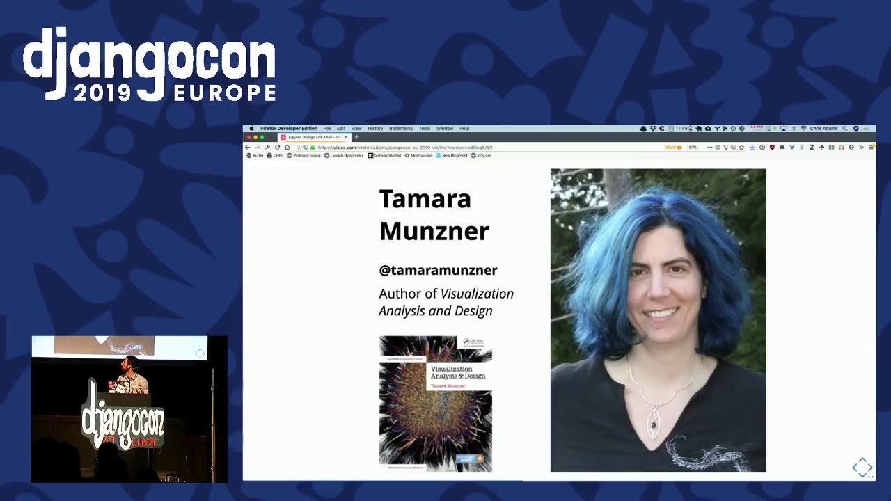
Speaker 1: But the idea is that you're there are there are there's more than one way to represent uh a data structure. And I think this is actually a really useful idea to hold on to. The other thing is uh when you start working with viz and think, oh wow, there's all these things I can do, it's very easy to get viz wrong. And like for example, when I think about pie charts, I assume they add up to 100%. And when I look at this, I'm not sure that it does, right? So this makes it harder for me to understand it. And it's as Pythonistas, if our main job is like writing code, it'd be nice if you could do something like, I don't know, pip install viz knowledge, right? And at this point here, I'm going to talk to you a little bit about some theory because I've been having to explore some of this with work recently. If you had to just buy one book for the next 10 years to help you understand visualization better, I'd suggest it's this one here
Speaker 1: by Dr. Tamara Munzna. Her book was life-changing for me and uh it's common to think like you read a book and we think, oh that's cool and that's cool. This was the main thought I had when I was reading this talk. When I was reading this book. And I've linked to a video which is an hour long, which basically presents all of her ideas. or all of the ideas in the book in a really, really nice format. And I I seriously it's it's it really really changes how you think about visualization and presenting things. And the key thing that the key takeaway from that talk, which I'm going to kind of r run over quickly is that We have way the data in the world of Dataviz, we've got a lot of similar ideas that map really nice nicely to our concepts. So we've got things like say in Dataviz, you've got like data types, which are a bit like our data structures And then they might come in different shapes. So you might have tabular ones, you might have links
Speaker 1: and graphs or trees. Like this stuff shouldn't be that. This should feel relatively comfortable to you if you're used to working with data. And then each of these data types have uh items inside them, have attributes, just like we do. All right? And these attributes can come in different flavors. So we've got categorical things. And then we got which are like uh different t kinds of things. And then there's like ordered, right? Maybe ordinal, which is not necessarily a kind of discrete scale, but is more uh it is discrete, not continuous. And like quantitative, you see like there's different things like this. And uh once you've got some items uh in in a data structure with attributes, you might represent them um as a mark on a page or on a screen. And these marks might come in different flavors. So you might have like points and lines and areas, but
Speaker 1: and then you will encode information about each of these marks to convey meaning using some of these channels. So you have different ch different channels available to you. So you might have things like position being one, or you might have colour being another or shape. And uh you can use these in combination to basically can you convey a greater amount of information in a small s in in in a limited space. And just to make this feel a bit more kind of c comfortable, I figured I'd share some examples of this. So on the left hand side we have a mark, which is a bar chart. So we've got a bar mark And we're encoding information in two parts. We're using the exposition for this part here and the length. But uh likewise we could do we can change the mark and convey the same information as dots. But if we wanted to encode more variables in this, we might choose to have color
Speaker 1: to show something else about this. Likewise, if we wanted to encode size, then we can once again in the same space encode more amounts of information in the same amount of space. And uh at this point here you might think, well, okay, this is cool, but I don't know what if I how do I make how do I know that I'm doing this right? How do I know that I'm actually using the correct kind of channels to encode the correct kind of information. The nice thing is is that people have been thinking about this for a really long time and they've actually been testing this kind of stuff with various tools. And like there are helpful tables like this which you can kind of check. And this helps us understand why bar charts are often so popular and so effective. Because they're basically positioning things on a common scale, usually uh uh from uh in a series of uh on on like
Speaker 1: from left to right and we might use different colours to explain why they're different. And like this is actually quite useful because this gives us a kind of cookbook. or set of things that we can refer back to. If we're trying to find a way to communicate a dense amount of information to people who are often either not uh either distracted or they're working on uh an a a number of other things or they just don't have that much time So we might think, okay, how do we use this? This is nice, but I'm just sharing like academic theory with you. So the nice thing is, is that all this kind of really all this thought, like really solid foundational stuff, is encoded into a library called Vega Lite. And uh all these diagrams here basically use that vocabulary that I just shared with you now. So you've got some really, really cool WYSI analysis and everything like that, but there is basically a kind of JSON data structure to describe these
Speaker 1: That you can actually, well basically display. And I'll just show you some examples of it so you can see what it looks like. So we've got a simple bar chart here which is showing rain in Seattle. We've got a data set coming in, and then we're choosing to kind of represent that using a bar mark that we had before. And then we're encoding in X along along here. We're encoding kind of the time. And then for the amount of rain, we're using that precipitation, which is inside this and we're showing that we're saying it's quantitative and that's how we can basically end up with a fairly simple diagram like this. Like this is cool, but we can do more So we can have say two marks on the same chart to show us things like say the mean amount of uh precipitation or obviously some stuff here, right? You can add more information to the same space. And like this is cool But I'm now making you
Speaker 1: need to like think about JSON and JavaScript. And like I'm at a Django conference where we're more comfortable using Python. Thankfully, this is actually uh basically done in Python. This it would be really nice if we could have something like this, right? We want to import a URL to show something, and then we could just use our Python library to say, well, I'd like that, and I'd like that. And uh this is basically what outer is. Some people have taken the ideas of Vega and Vega like with all the solid theoretical underpinnings. And they've basically written a nice Python wrapper around this stuff. So all the cool WYSI charts that I'm not showing you elsewhere, but on this page, you can make using Python now. And uh I'll explain what it's doing under the hood because that might help give you some kind of understanding here. Alright? It's called Altair, and what outer
Speaker 1: is doing is basically working with uh we we're using a DSL here which spits out some vagar light here Vega Lite then creates another another kind of more kind of dense version called Vega and then we start working with D3. Who's in on has anyone worked with D3 here? Okay. How many of you enjoyed it? Yeah Right? And then that can can combine down to SVG or for performance we might want to have Canvas. So this basically lets us play around and express information that we actually have available to us. in a very very dense form without having to understand its entire stack. But if we do need to get help working with the stack, we're using common, well-known, popular tooling, so it's possible to actually get help with it with this. And uh I just want to say like thank you Jake. I don't think I'm ever gonna meet this man, but he's work
Speaker 1: been working on this more than anyone else. And uh I think that people if you're working at open source, it's really really useful to actually I acknowledge this stuff. Kind of like the Wi-Fi. The Wi-Fi's been awesome today, right? Anyway. So now we're talking about applying this. What can we do with this? So do you remember how I was talking to you about this diagram here where we've got a browser here and then a notebook server and a kernel doing some work? Well, if we were to implement this in our Django applications, it would look a bit like this So we've got a smiley face here speaking to a browser, and then we'd be using out air to generate some kind of JSON that we'd render in the browser. And then we might have some ORM or something, maybe SQL Alchemy now that we've discovered it does all these all these cool things And uh it might look a bit like this. So we've got like some basic uh model here.
Speaker 1: We might say do a do a call like this and we'll convert things into get our values back rather than the the objects because it's easy to work with And then we'll basically say, well, please take all the the this this list of objects and put it into a query in into a list of of kind of dictionaries that we can work with, then we'd pass that in, and then we'd encode using the marks that we wanted, and then we just return it as a JSON response. And then in the actual page that we'd be showing, we'd have well we'd have a URL a URLs to kind of hook this up so the next page makes sense. But we'd end up with something a bit like this. So we fetch Vega, Vega light, these bits here, and then we might have a div called viz that we will replace with it. And then we just fetch our thing and then we say please t please do the toString or toViz method on the JSON that we get back
Speaker 1: And then that's basically it. That's how we can basically work in Python, use tools we're comfortable with to explain ideas and explain things visually with people, and actually make it available to people on the web. And I'm going to try for a quick and dirty example now because I did use the word quick and dirty in the talk title. Alright? Has anyone heard of drawdown here at all? Okay, cool. We've had two or three people put their hand up. This is really, really cool because okay, climate change is a thing and we should probably be thinking about it more as professionals And uh these uh drawdown is basically a project where people have looked at the 100 most substantive solutions that you could apply. Now, there's all kinds of questions about like the assumptions made in this neoliberal kind of framing of this, but there is a lot of interesting stuff inside this and they do have a kind of ranking of all the charts of
Speaker 1: all the things that might all the kind of interventions that we could actually do too well I don't know, stay in a inhabitable world, right? And uh I'm gonna show you what some of this looks like with those code examples to kind of prove that it really does work. And uh but before I do that though, I'm gonna show a screenshot. So in just in case the demons the the the demo gods didn't smile upon me. So let's see if we can go with this. I'm gonna try and grab it now Okay, can you see something turning up? Yes, you can. Cool, right. So what you're looking at here is basically the code that I showed you a minute ago, right? And if I can zoom, am I able to like increase the size of this? Oh god, what have I done there? Let's close that. Can I? Yeah, there we are now. Yeah. So this shows us all the things that we might want to do, right?
Speaker 1: And we might think of things like, okay, like electric cars are going to be saving us or anything like that. But when you look at this, you can see that electric cars aren't actually that much of a of an intervention, right? The biggest single biggest thing that looks like it's going to actually bias time is actually fixing how fridges are disposed of because they release these CFC these the these gases which are really really really bad news for the f uh uh w when they're in the atmosphere. But you also see some see some other things like some really big things here, food waste, which what we were speaking about yesterday. That's a massive lever So is actually diet, which is which came up a t a few years ago. But you can see down here, like two two of the biggest things actually if you combine them they're probably the biggest thing Like treating women with dignity really, really helps, it turns out, because it changes how families work.
Speaker 1: And uh there's there's there's things like say if you have access to family planning and give people access to to choice and then though the way that families grow ends up being different as well. But there's loads of interesting stuff which we wouldn't have seen if we just looked at like say a single kind of CSV file. And uh you can explore this stuff yourself. And there's loads of other ways of presenting this. And it looks different menu because I wasn't sure if you could actually see it on this on this on this uh screen. So I'm just going to try and close this now And use the last of my time to say, is that right? Yeah, that worked. Is that if you do care about this stuff, um I'm working with a company who basically paid for us to work on uh on on and find out this kind of stuff, they're called Spend Network they're hiring and they're looking to use these ideas or basically take the last 10 years of open data to find out how public 's uh m money is being spent.
Speaker 1: And basically see where the inter where the biggest levers are in terms of climate change so you can do something there too. They're hiring, so please do speak to me afterwards. But I said I'd talk to you a bit about notebooks, give you some theory, and show you how you might apply this theory in your work so that you can actually present things in a kind of a visually arresting and interesting and if and dense way using these tools Jupiter, Outer and Django. And I think I did that. So I'm gonna say thank you everyone Yeah , I think that's a good idea. I have this opinion, this weird opinion, that if we're professionals, then we should think about the harm that what we do, we think about the harm caused by how we work and we should try to minimize it.
Speaker 1: And I think that if you're not doing that, I would argue that you're not really being all that professional And uh I'm running this uh workshop tomorrow to kind of explore that with other people because yeah, the biggest lever we have is the fact that pretty much everything we build runs on fossil fuels right now and like this is such an easy thing for us to fix So yeah, if that interests you and like the continued existence of humans interests you, please speak to me or come to the workshop tomorrow. And uh uh this deck is online and the code that I showed you, the Django app, that's also online, so feel free to fork it, and you can see how you can actually use, say, iPython to speak to a Jupyter notebook and have some fun with it. Okay, that's it. Uh I think we've got time for questions, yeah. I don't know. Do I have time? Yes.
Speaker 2: We have about four minutes for questions. Uh so we can do DjangoCon, hashtag DjangoCon QA online, or you can line up for questions.
Speaker 1: There's always a question.
Speaker 3: Thank you for your talk. It was very, very informative. doing very different kinds of data analyzation and visualization. But do you have any resources on how to choose the correct type of visualization to provide? Because that's pretty tricky.
Speaker 1: Yes, there is actually a really good resource from the Financial Times. Uh they do actually list this. I'm see if I can find it right. So financial so Financial Times have this basically list And it's also using uh the Vega and Altair tools, right? So basically this thing was pr pr produced by I think Financial Times saying this is how you should use our charts And they use it internally and they shared it because it makes them look cool. And then someone's taken that idea that, oh, that's kind of cool. Maybe I can implement that in Vega, which means we get all of that. So how cool is that? That's my answer. I'll share the link for it
Speaker 4: Um thank you for the very interesting talk. Uh you've shown a picture of the Netflix architecture. Yes. And You don't have to scroll back. Um even though most of those things, as you said, are open source, they are probably on a different scale. So I'm wondering um How can you use the code in um Jupyter Notebooks without like running a kernel? Because like I reuse it in Python without Not the overhead of the kernel but like I don't I don't have want the kernel running on the servers and so on.
Speaker 1: Okay, so the the approach I take and uh the thing I've been using uh let's see if I can share this Because uh is this gonna work? Nope, it's now it's now we've got we know we're at this conference. So I was gonna show you uh an example of some code in Jupyter that I'd be using in a kind of scratch session like I would be using in in iPython. Then I take those bits and put it into a class and then call methods that way. That's the kind of like working in the REPOR approach that I guess the closure community are known for and a few other ones are So you don't actually need to be running all this stuff. You can just actually work out the bits of Python that you care about and then call those on like I don't know, you could probably call it on a serverless function if you've if you if you really wanted. But now we know there's more to it than that So yeah, that would be my answer. But I'm happy to talk in in more detail afterwards. Yes, sir.
Speaker 5: Uh thank you. Uh what is the best way to make the notebooks available to other people? Because you said it's just a URL, but like Uh to make it not publicly available on the internet.
Speaker 1: Ah, there are a few ways. So if you use VS Code Uh our FU has gone to most IDEs now. They've realized that notebooks are really, really handy. And uh because most lots of the kind of cool new editors have are basically running on Chrome. You can basically use that stuff internally. So you can actually export things as as as Python. But also Google have a thing called Colaboratory, which is free to use and it just gives you some magic. uh kernel somewhere that you can use, but there's also a tool called binder which lets you run these things internally as well, which basically spins up loaded Docker containers according to your requirements file and then you can have that on your own hardware or if you have if you if there's no reason to hide what you or no reason to not share it. you can use it on public infrastructure as well. There's also this massive European science cloud where they just like provide kernels for you to plug into.
Speaker 1: So yeah, there's a there's lot there's lots of options and I'm I'll I can add some links to this talk afterwards actually. Or file an issue and I'll add some more links that way. Thank you. Yes, sir.
Speaker 2: Hi. And we have a great speaker next. Um, but I'm sure we can find you uh around. Awesome. Yay.
Speaker 1: Thank you, everyone.
Jupyter notebooks are browser-based, shareable and reproducible narratives that combine code, output, text, and visualizations. The talk describes uses ranging from data journalism and interactive teaching to DevOps runbooks and large-scale analysis at Netflix.
Discussed at 3:10The browser communicates with a notebook server, which passes code to a kernel that executes it and records the results in a shareable notebook file. The kernel can run Python, R, Julia, or another language, and can be hosted on anything from a local Django process to a remote compute cluster.
Discussed at 7:47Altair is a Python wrapper around Vega and Vega-Lite, allowing you to describe interactive charts in Python without directly writing JavaScript. In Django, you can query data, pass it to an Altair chart, return the chart specification as JSON, and render it in the browser with Vega/Vega-Lite.
Discussed at 16:16The speaker recommends the Financial Times visualization guide, which explains how to choose and use chart types. The guide's ideas have also been implemented using Vega and Altair.
Discussed at 24:30Use the notebook as a scratch or REPL environment, then move the useful Python into a class and call its methods from the application. The resulting code can run directly on a server or even in a serverless function, without keeping a notebook kernel running.
Discussed at 25:32Note: We understand that names change, people change, and bodies change. We respect each individual's journey and privacy. If you have any concerns about a video or need us to remove content, please don't hesitate to contact us. We will handle your request with care and promptly address any issues.

Published June 13, 2025

Published June 13, 2025

Published June 13, 2025

Published June 13, 2025

Published June 13, 2025

Published June 13, 2025

